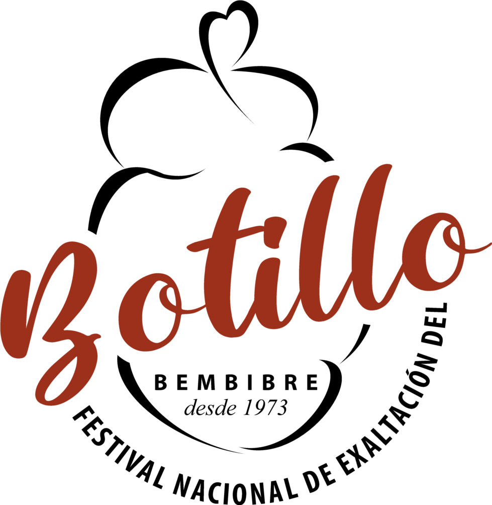
The Botillo Festival presents its official logo to reinforce the identity of the event.
Today we are in luck! The Botillo Festival has a new logo in which it intends to reinforce its identity within and beyond the local area. The main objective is to enhance the event and achieve its best tourist standing with a unified image in all activities.
This logo establishes the brand of the National Festival for the Exaltation of Botillo which, in practice, has existed since the first editions. However, it did not have an image representing either the festival or the related cultural activities. Only in the 2023 edition was a commemorative logo presented specifically for the 50th anniversary, which served as the basis for developing this idea.
“Last year we made the first step and announced that we would start working on the logo that we present today,” said Belén Martín Díaz, Councilor for Culture, Festivals, Tourism and Commerce of the Bembibre City Council. She is convinced that “this new visual identity will serve to support the promotion and broadcast of the Botillo Festival in any context”.
This logo, created by the graphic designer Natalia Rincón from Bembibre, takes the form of a ‘logo” formed by the word “Botillo”, with a calligraphic typography that enhances the traditional values associated with the Brand and the icon that symbolizes the sausage that is evoked.
The graphic set is completed with the elements that identify the festival, the location in Bembibre and its history, highlighting its traditional character with the inscription “since 1973”.
Martín Díaz has been pleased with the final result since “we have achieved a well-designed logo to express the value of the National Festival for the Exaltation of Botillo and enhance the brand beyond the tasting of the sausage”. “It is a logo that has developed a Bembibrense, who know very well Bembibre and the Botillo Festival and what it means for the town,” she said. This new logo “is the visible face of the National Festival for the Exaltation of Botillo “.
This visual identity will be part of all activities related to the event, as well as be incorporated into the official poster, leaflets and tickets. It will also identify the official website and its social networks, as well as all official and institutional material. “It is a work that we have just launched in this 51st edition and we know that it will take time for the public to become familiar with it”, suggested the councilor, but “we will expect that when visualizing any part of this image people know that it is the Bembibre’s National Festival for the Exaltation of Botillo “, she concluded.